
Prints, Pastels and Power Dressing Sarees for the Modern Professional
 198
198
somewhere along the way, power dressing in india got flattened into a single idea: solid colours, minimal surface interest, nothing that could be mistaken for decorative. the logic made sense at the time. when proving yourself in a room, the thinking went, let your words do the work and let your clothes stay neutral.
that logic is increasingly outdated. the workplaces where it still applies are outnumbered by the ones where showing up with a clear visual identity is an asset. a considered printed saree, worn with intention, is not a distraction from the work. it's an extension of the same confidence that does the work.
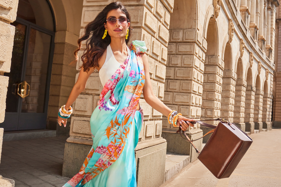
navyasa by liva's range of printed sarees, floral print sarees, pastel sarees, and formal sarees for women understands this shift. across liva satin, liva silk, liva crepe, and liva chiffon, the label has built a collection of office wear sarees and work wear sarees where print is not decoration applied to a garment but the actual point of the garment. here's how to work with it.
the case for prints in the professional wardrobe
there is a version of professional dressing that reads as powerful precisely because it takes a risk. a printed saree for women, chosen with the right restraint in terms of scale and colour, communicates something that a plain one can't quite reach: that the person wearing it has a settled sense of what she likes and is not performing neutrality for the room's benefit.
the key word is restraint. a print that works for office wear sarees tends to have either a controlled palette or a controlled scale, and the best ones have both. large, graphic abstracts in two or three colours. small, precise florals on a ground colour with presence. geometric structures that give the eye something to follow without overloading it. navyasa by liva's collections lean into each of these registers, across multiple fabrics, so the choice is never between having a print or not. it's about which print, and in which fabric, for which kind of day.
pastel sarees: soft on colour, firm on presence
there's a case to be made that pastel sarees are actually harder to dismiss in a professional setting than darker, more overtly dramatic colours. pastels don't announce themselves the way deep jewel tones do. instead, they accumulate. they photograph cleanly, they work across seasons, and they create a visual softness that turns out to be far more persuasive in rooms that require consensus-building and collaboration than anything loud.
the serene strands saree in lilac, liva silk is one of the cleaner examples of how a pastel printed silk saree can carry itself in a formal context. the lilac is true pastel, not washed out and not pushing towards purple. the strand pattern gives it structure. on liva silk, the surface has the kind of considered sheen that reads as elevated without requiring effort to maintain throughout the day.
the daisy chains saree in light green, liva silk takes the pastel logic into botanical territory. light green is one of those colours that works almost regardless of skin tone, and the daisy chain print gives it a botanical precision rather than a casual floral looseness. as a printed silk saree for the office, it occupies a comfortable space between fresh and formal. paired with an ivory or white blouse, the whole look lands clean and considered.
in the satin category, the bloom riot saree in peach, liva satin makes the pastel argument with more colour confidence. peach on satin has a luminosity that reads differently from peach on matte fabrics. it catches light in a way that gives the colour depth without shifting it away from its essential softness. the bloom riot print brings in a floral density that, on satin, lands as rich rather than busy.
floral print sarees at work: reframing the conversation
floral print sarees have historically sat in the casual and festive columns of most people's mental wardrobe grid. the reason is usually about scale: oversized, exuberant florals read social rather than professional. but that assumption doesn't hold when the floral print in question is precise, the palette is controlled, and the fabric has the right body to hold the print without letting it sprawl.
the echoed blooms saree in yellow, liva silk is a study in how a floral print saree crosses into formal saree for women territory without losing what makes it interesting. the yellow is warm and present without being aggressive, and the echoed blooms pattern has a botanical illustration quality to it. the repetition of the motif across the fabric gives it rhythm rather than randomness. on liva silk, the drape does the rest.
the jasmine veil saree in blue, liva silk approaches the floral brief from a cooler direction. blue as a base colour for a floral print saree carries an inherent formality. the jasmine veil print sits over it with a delicacy that doesn't compete with the fabric's surface. this is the kind of professional office wear saree that suits environments where the dress code exists but so does individual expression.
in liva satin, the blossom rhapsody saree in blue, liva satin takes the floral print saree in a slightly more considered direction. the blue satin ground gives the blossom print a firmness that chiffon-based florals don't quite achieve. it has the visual weight of a formal saree without the stiffness, and the satin surface means the print catches light in ways that feel dynamic across a full day of varied lighting.
satin printed sarees: the sheen that reads as serious
satin has a reputation for evening and occasion wear that undersells what a satin printed saree can do in a professional context. the surface reflects light rather than absorbing it, which gives prints on satin a different visual quality: more precise, more graphic, more defined. for work wear sarees, that quality translates into a look that holds its structure visually even as the fabric moves.
the tessera threads saree in mustard, liva satin is worth examining closely for its colour and print combination. mustard is one of those colours that reads confidently across a wide range of office environments without requiring the same level of deliberate styling that a more extreme colour demands. the tessera pattern, with its mosaic-like interlocking structure, gives the saree an architectural quality that makes it a natural fit for professional office wear sarees. the pixel noir saree in black and white, liva satin is a different kind of statement. black and white as a palette in a printed saree removes colour from the equation entirely and lets the print structure do all the work. on liva satin, the pixel-inspired graphic reads as sharp and deliberately designed. it's one of those formal sarees for women that communicates a design sensibility without having to announce it.
for a printed satin saree with more warmth, the garden of eden saree in maroon, liva satin brings together a deep, considered ground colour with a botanical print that has exactly the right level of density. maroon on satin has a richness that works across both formal and semi-formal office contexts, and the eden-inspired print lifts it beyond the monochromatic without disrupting the overall seriousness of the look.
printed silk sarees: the elevated register
liva silk occupies a different position in the printed saree conversation. where satin is graphic and chiffon is airy, silk sits in a register that feels inherently elevated. a printed silk saree carries the authority of the fabric as a baseline and adds the personality of the print on top of it. for professional formal sarees for office wear, this combination is particularly effective because it's never in danger of reading as underdressed.
the ornate scrolls saree in turquoise blue, liva silk is the kind of printed silk saree that makes a case for itself without needing a brief to explain it. turquoise blue is a colour that photographs exceptionally well and holds its own in natural and artificial light equally. the ornate scroll pattern gives the fabric a formal decorativeness that, on silk, feels earned rather than imposed.
the serene echo saree in yellow, liva silk approaches the printed silk saree brief with more colour. yellow on silk reads warmly and generously, and the serene echo print pattern has enough repetition to give the saree visual structure without becoming predictable. it's the choice for workdays that call for presence without formality's more rigid edges, particularly in environments where creative output is part of the brief.
printed crepe sarees: where structure meets surface
printed crepe sarees round out the power dressing conversation with their distinct advantage: the fabric's natural texture means prints on crepe never look flat. the slight surface dimensionality of crepe gives printed motifs a quality that neither satin nor silk quite replicates. for office wear sarees where the goal is to look structured and interesting simultaneously, printed crepe delivers on both counts.
the botanic impressions saree in pink, liva crepe brings a botanical print to crepe in a way that keeps the overall look anchored and mature. the pink has warmth without moving into the territory of the occasional where softer colours can sometimes sit. the botanical motif on crepe has a naturalistic precision that works well in professional formal sarees for office wear contexts where detail is appreciated.
the rosette dream saree in blue, liva crepe brings a floral print saree logic to the crepe category with a colour that grounds it firmly in formal saree territory. the blue base on crepe has none of the lightness of blue on chiffon. it sits firmly, holds the rosette print clearly, and creates a work wear saree that reads as both intentional and put-together across the length of a full professional day.
artisanal sarees: handcrafted tie-dye for everyday professionals
tie-dye as a technique has a reputation that undersells what it can do in a professional wardrobe. the resist-and-release process that defines it is, at its core, a craft: each saree worked by hand, each pattern shaped by the maker’s decisions about where to bind and where to let the dye move. the result is a surface that no machine print replicates, and that quality reads differently in a work context than decorative pattern does. it is not embellishment for its own sake. it is evidence of making, and in rooms that notice considered choices, that distinction lands.
navyasa by liva’s artisanal elegance collection works in shades that earn their place across a full day: deep indigos, warm rusts, sober blacks, and versatile multicolour combinations that move between desk and dinner without requiring a second thought. the fabric is liva satin, which gives the tie-dye surface a soft sheen and a fluid drape that reads as polished in a meeting room and just as right after hours. it is a rare combination in workwear: something handcrafted that also happens to be practical.
how to wear a printed saree to work: three approaches
the first approach is tonal restraint. when the printed saree has multiple colours, the blouse should pick up one of the quieter tones in the print rather than the loudest. this keeps the print as the focal point without the blouse adding competition. a blouse in a shade that's in the print but not the dominant one threads the whole look together.
the second approach is contrast anchoring. a printed saree in a pastel or mid-tone palette can be given more weight for a formal office context by pairing it with a deep, solid-coloured blouse. navy, forest green, deep wine, or charcoal against a pastel saree grounds the softness of the colour without suppressing it. the result is a professional formal saree look that has both lightness and authority.
the third approach is surface simplicity everywhere else. when the saree is doing significant visual work through print or sheen, the accessories, the footwear, and the blouse all benefit from quieter choices. one considered piece, such as a pair of structured earrings or a single wrist stack, is usually enough. the saree online shopping question that matters most is not just which print to choose but how much space around it to leave. the full range of printed sarees, floral print sarees, pastel sarees, and formal sarees for women is available at navyasa by liva collections with options across every fabric category and occasion filter.
frequently asked questions
can a printed saree work as formal office wear?
yes. a printed saree in a controlled palette and appropriate scale reads well in most professional environments. the fabric matters: printed crepe sarees, printed satin sarees, and printed silk sarees all have a surface quality that gives the print formality. choosing a print with geometric structure or precise botanical motifs rather than large, loose patterns also helps the saree land in formal saree territory.
what makes a pastel saree appropriate for the office?
pastel sarees work for office wear because they carry a quiet authority that doesn't require the same level of deliberate styling that brighter colours demand. on fabrics like liva silk or liva satin, pastels have surface luminosity that keeps them from reading as plain. the key is pairing a pastel saree with a structured blouse and keeping accessories restrained.
are floral print sarees suitable as work wear sarees?
floral print sarees with a controlled scale and a formal base colour, such as blue, green, or deep yellow, work well as office wear sarees. floral prints on formal fabrics like liva silk and liva satin have a botanical precision that differs from the looser, more celebratory florals associated with casual or festive wear.
what is the difference between satin printed sarees and printed silk sarees for the office?
satin printed sarees have a reflective surface that makes prints appear more graphic and defined. printed silk sarees have a softer sheen and a surface that feels more naturally elevated. for office wear, satin printed sarees tend to make a stronger visual statement while printed silk sarees carry a quieter authority. both are effective professional formal sarees for office wear, depending on the specific environment and occasion.
how do i buy printed sarees online in india?
navyasa by liva's online store allows browsing by fabric, print type, and occasion, which makes it straightforward to find printed sarees suited specifically for work wear or office wear. the site carries liva satin, liva silk, liva crepe, and liva chiffon sarees with free shipping across india.
browse the full range of printed sarees, pastel sarees, floral print sarees, and formal sarees for women at navyasa by liva. find the work wear saree that says exactly what you want it to, without having to say anything at all.